draft.cardsphere.com

Today we launch draft.cardsphere.com, our latest software for the Magic community. We've been so excited, and have had so much fun building this that we've just barely been able to keep it a secret! Of course, we realize that many of you may be thinking that it's kind of a weird move for a marketplace service, so let me tell you about how we came to the decision.
Before Guilds of Ravnica dropped, we were thinking about ways to make it easier for people to discover Cardsphere. We're already the top natural Google results for "trade magic cards", and cooperate with a number of amazing streamers and content creators who also help us produce fantastic content for our blog. But the bigger the trading community gets the better Cardsphere works for everyone, so we're always looking for ways to improve our reach. We've dabbled in Facebook and Twitter ads, and those didn't really deliver. It became obvious that promotion works better when the focus is on Magic and not the product. That got us thinking, and the conversation drifted to something we do, as Magic players, before each set is released... Draft simulators.
So I asked Michael and Efren what they thought about buying advertising on a 3rd party draft simulator. I could tell Efren liked the idea. He and I immediately started to talk about draft simulators we'd used, comparing features they had and lamenting over the features we wanted but were not available anywhere. Michael stayed silent and listened to us prattle on. I was worried he hated the idea.
Until he said "Why don't we just make one?"
A Draft Simulator the Cardsphere Way
Now, when Michael wants to make something, it gets done.
Efren and I quickly agreed and we got down to business. We expected that a solid draft simulator that didn't rely on ad revenue would bring people in on that basis alone. But we also know that people like clean, simple interfaces that offer great features. So we had our starting point.
Let me give you the tour. For now, we've got the system up and running with all the sets in Standard plus Ultimate Masters.

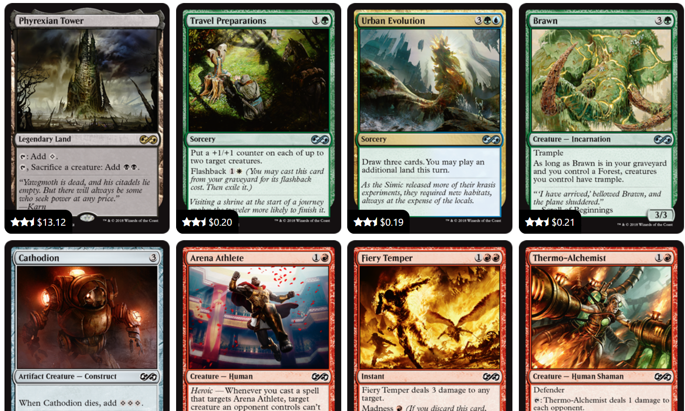
Under Picks you see the pack you're currently drafting. We paid special attention to randomness of pack contents for a very realistic draft feel. The menu bar always shows you where you are in a draft. The Deck page shows you the cards you've already chosen, lets you move cards between maindeck and sideboard, and reveals what the bots are up to. Click on any bot to check out what they've drafted, and note the direction of the draft is displayed as well.
We couldn't resist naming the bots after some of the great people we get to sponsor, so have fun hate drafting against Jeff Hoogland and Pleasant Kenobi among others.

It would not be a Cardsphere product if we didn't take it a notch further than the competition. Early on we discussed how people share around Pack 1 Pick 1 on social media, and how we'd like to extend this functionality a bit. When you click Share you're offeRed a choice of three different options.

Deck provides a view-only link of the current state of your draft. Usually, you'll use this to share your results with someone, but you can use it at any time. People with the link will see the draft's current status.
Picks gives you a permanent view-only link to your current picks. Even if you continue with the draft, the link will always show people the state of the draft from when you created the link. This is the link to use when asking about Pack 1 Pick 1, for example.
Both of the view-only options let visitors look at your current pick, your deck so far, and what the bots are doing. But visitors can't make picks to progress the draft.
Draft, on the other hand, shares the same packs for others to try drafting. This way you can compare your skills against your friends. Let the trash talk begin.
It is worth noting that you (or anybody with a link) can re-start the draft with the same packs at any moment.
Use the View menu to set your display preferences. You can show or hide card ratings and prices. Cards have a base rating out of 100, and we apply an adjustment based on color affinity with your deck. For a quick view of the ratings, we display up to five stars, but you can tap the stars to see the full rating information. The price shows the up to the minute Cardsphere index price for the card. Click the price to visit the card page where you can review current best offers and recent trade activity for the card.

Sort the cards by rating, value, rarity, color or pack order.
What's Next
We have other interesting ways to further enhance the Cardsphere draft experience in new and exciting ways, but we'll let this initial version settle in for a bit first. As always, we want to know what you think. What else would you like to see in a draft simulator? What do you like or dislike about our design?
Of course, thank you to the many people who have provided feedback already. We've acted on a number of the suggestions we've received and plan more follow through on these.
Now, get out there and share those links around. And don't forget to tag us, we'd love to see what people get up to with this!
